Brochures are easy marketing mediums to ensure success in your business. It can be a bold move to show causes your products and services in a convincing way. They are also used as promotional items to make a break in your usual business sales volume. A creatively design brochure can be a show stealer and can win accolades for your business. Let the brochure design be mysterious on its outer cover to drag more viewership for the cards. This kind of brochure printing will ensure a better conversion rate and a better reach of information.
This article is a collection of red brochure designs which will suggest you make a selection out of wide range of designs.
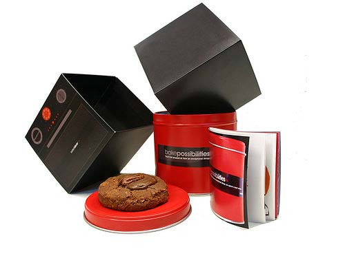
With a Cookie
The design will really look like a cookie in your kit. The front portion will have the tag line and the rest of the content in the hidden folds. It can have a box like cover and is an award winning design.
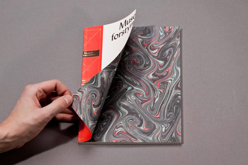
Abstract Brochure Design
The design is elegant, smart and simple. A light red shade combined with other floral colors adds beauty to your promotional theme. It is usually mixed with black shades in the back ground. The number of folds can be decided upon the content requirement.
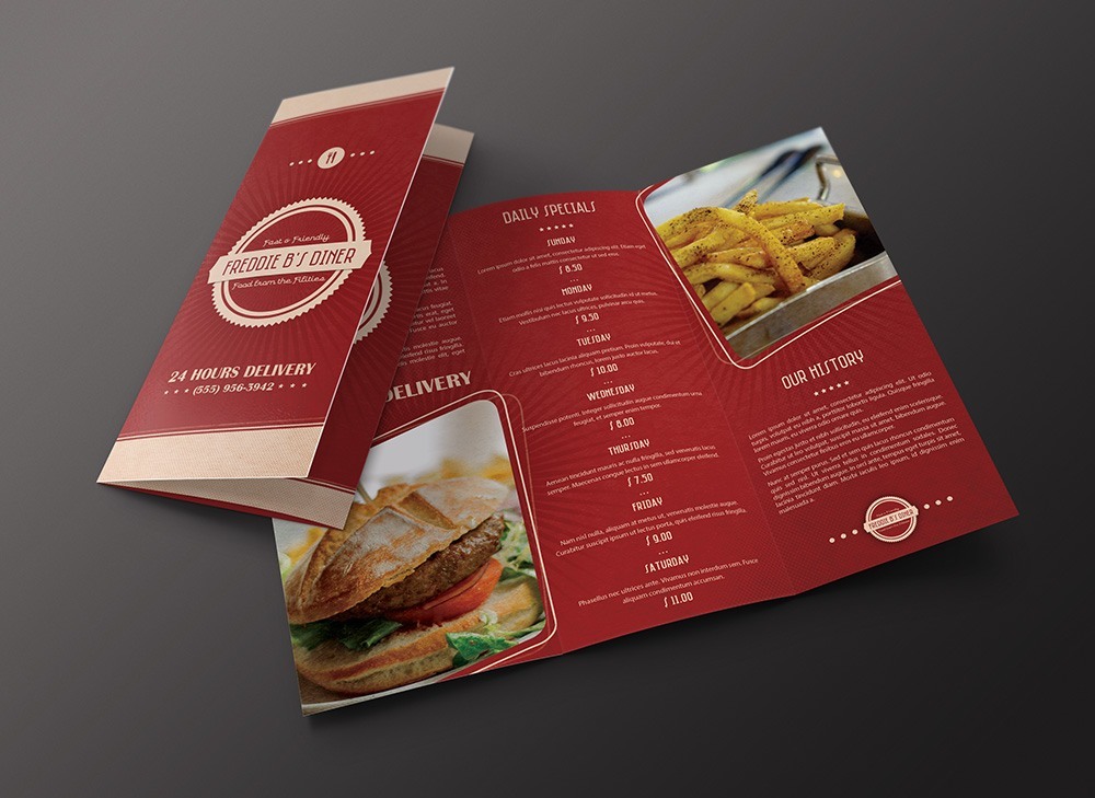
Red brochure
The brochure gives a royal feel due to the usage of color red with complementing gold. It is elegantly designed to be informative as well as aesthetically appealing. The middle section of the brochure leaves ample space for showcasing the daily specials in this case. The pattern of the brochure is perfect for a hotel delivery menu where one can show the name on the front, menu in the middle and the hotel history on the last page. The typography and the design usage on the brochure give a nice feel which ensures a comfortable read of the given data.
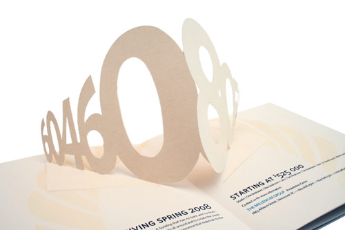
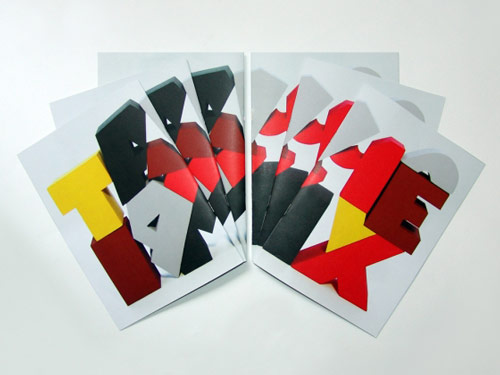
Pop-Out Brochure
You would have hit pop-out greeting cards in the stores. This brochure design is very similar and the letters or numbers will usually pop out when you open them. It has light red background or even a pink shade. It looks a better appearance to the card. Remember that the design should have minimal content.
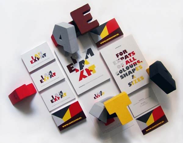
Expat Brochure
This is truly an amazing design with red colors in it. The beauty of this design lies in the font style. The card shape in which you make the design and the font style will decide the beauty factor. The card can be cut in to desired shapes and font styles as per your requirement.
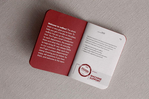
The Passport Brochure Design
It is look alike for your passport. Yes, the brochure will exactly look like your passport. The content can be filled in the pages that lay inside. The header and caption must be rightfully thought to grab the viewer’s attention.
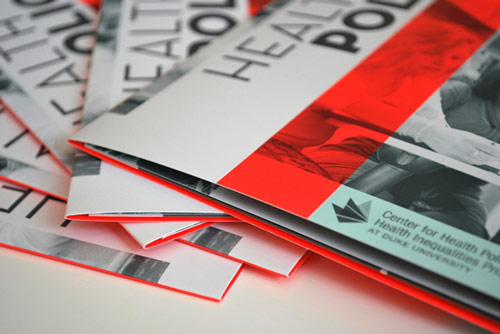
Red Brochure
This is one of the hottest red brochures. It has the shades of different colors but with red being the center of attraction. A lighter shade of red will look fine and it seems the designer has understood it. Vertical and horizontal shades across the card will offer an appealing look. This design will be a worthy bet.
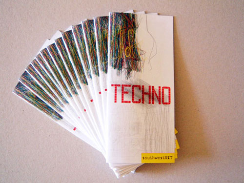
Techno Brochure
It is a common greeting card style design. However, the label stuck on its footer note makes it attractive. Either the background can be in light red shade or the foreground text color can be in red. Make sure it is not stuffed with too many pictures that will occupy the entire size of the card.
Convenient Brochure Design
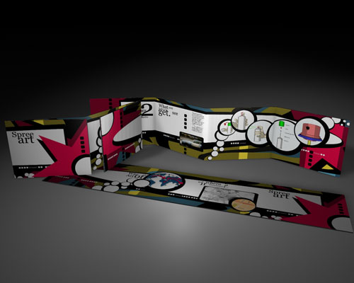
It has several folds which can be extended in its horizontal path. It basically looks like a snake crawling on the ground. The designer has done it extremely well to give an appealing look. It invites free art style to fill the content.
The Map Design
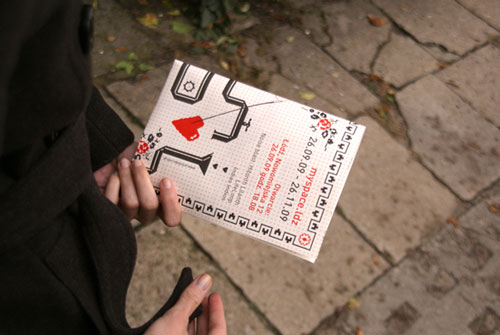
This kind of brochure design is not very common. I am not sure whether it will fit all sorts of business requirements and demands. However, with a good amount of creativity any design can be customized. With a subtle design, it easily captures the attention of the viewers.
Michigan Maple Block Brochure
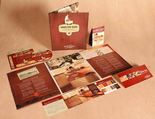
This is one of the most complicated brochure styles. Usually, business men in the realty sector use this kind of style. It will be helpful when you try to give a lot of information to the users. It takes a lot of money and efforts in creating this kind of brochure.
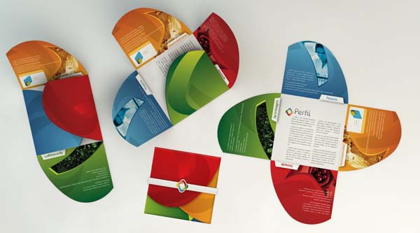
Media Life Brochure
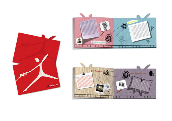
It has an envelope and the card inside. Usually the envelope comes with a unique design pattern and in red color. The inside card can be in any color and can have any number of folds. The cards look so stylish and a proper content will ensure a better reach of information.
Window Light Studio Brochure
If you have been on the lookout for a stylish brochure design, then your search finally ends here. It is nothing short of a beautiful brochure design. Though the card has the red color on its majority share, it has a beautiful blend of other colors in it. This card is intended to have minimal content and with majority of pictures or images.
Leporello Street Brochure
As the name indicates, the card can be elongated in its horizontal path. It mostly has the red shade on the borders. It is mixed with white color on a majority note. The font is mixed with white and black shades to give an appealing look.
G Design Studio Brochure
You will be stunned to see the card and it looks luxurious in the design. You will love to promote your business through this kind of card design. It has the rightful combination of text and images. Some of the text can be made as a pop-out in the card. The design can be complicated as well and the designer has to carve out the requirement carefully.
I am sure the above described card designs are best suited to promote your business. It requires a creative approach to mix and match the card style and the color themes. Make sure you do not make any mistake in promoting your business plans.


